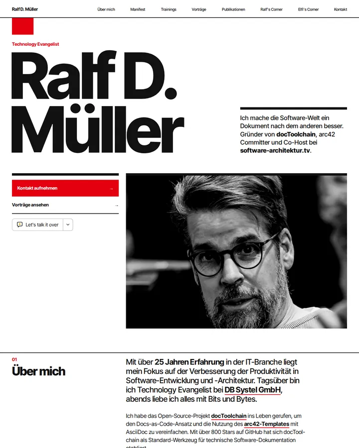
Swiss Style, also called the International Typographic Style, is the grid-based graphic design of the Zurich and Basel schools from the 1950s. It sets a modular grid first, uses sans-serif type such as Akzidenz-Grotesk or Helvetica flush left, ragged right, balances elements asymmetrically and puts clarity before expression.
Swiss Style (International Typographic Style)
Details
- Full Name
-
Swiss Style, also called the International Typographic Style — the grid-based graphic design that came out of the Zurich and Basel schools of design in the 1950s
- Also known as
-
International Typographic Style, Swiss design, Swiss typography
Core Concepts:
-
The grid comes first. A modular grid of columns and rows is set before any element is placed, and every element sits on it. Josef Müller-Brockmann’s Grid Systems in Graphic Design (1981) works through grids from 8 to 32 fields.
-
Sans-serif type, and little of it. Akzidenz-Grotesk, later Helvetica, in few sizes and weights. Hierarchy comes from scale, weight and position, not from ornament or a change of typeface.
-
Flush left, ragged right. Text is aligned to one edge and never justified, so word spacing stays even.
-
Asymmetric composition. Elements are balanced against each other and against empty space rather than centred on an axis. The white space is part of the composition, not what is left over.
-
Objective imagery. Photography or abstract geometric forms instead of illustration; the picture shows the subject, it does not interpret it.
-
Clarity over expression. The designer’s job is to make the message legible and ordered, ideally across languages. This is why the style became the default for signage, corporate identities and public information.
- Key Proponents
-
Ernst Keller (taught at the Kunstgewerbeschule Zürich from 1918); Josef Müller-Brockmann (Grid Systems in Graphic Design, 1981; concert posters for the Zurich Tonhalle); Armin Hofmann (Graphic Design Manual, 1965) and Emil Ruder (Typographie, 1967), both at the Basel School of Design; the Zurich journal Neue Grafik, co-edited by Müller-Brockmann
When to Use:
-
Posters, flyers, menus and event material that have to be read at a glance
-
Signage, wayfinding and information graphics
-
Layout systems for websites, slide templates and reports, where a grid keeps many pages consistent
-
As a counter-instruction when generated designs drift towards centred layouts, decorative fonts and stock illustration
Common Misunderstandings:
-
Reading it as minimalism. A Swiss Style layout can be dense; what defines it is the grid and the order, not the amount of empty space.
-
Reducing it to Helvetica. The typeface is the most visible trace, but a centred, symmetric poster in Helvetica is not Swiss Style.
-
Confusing it with Bauhaus. The Bauhaus and Jan Tschichold’s Die neue Typographie (1928) are its precursors; the Swiss schools turned their ideas into a teachable system in the 1950s.
-
Using the bare name outside a design context. "Swiss style" also names food and products. Asked "What is 'Swiss Style'?" without context, every tier we tested answered with graphic design. The alias "International Typographic Style" does the same work: in a follow-up test on 2026-10-25 with the same poster task, six of six runs set a modular grid and Helvetica or Akzidenz-Grotesk, built the poster from type and geometric forms without illustration, and five of six named flush-left, ragged-right text.
Criticism:
-
Cold, formal, dogmatic — the post-1968 charge, and a Basel teacher led the opposition. The Swiss National Library writes in "Postmodern posters, 1970 to today" that after 1968, with the criticism of consumer society, the International Style "came under fire as its cold, formal, dogmatic aesthetic was questioned". Wolfgang Weingart, who taught in Basel alongside Armin Hofmann, "led the opposition to the International Style".