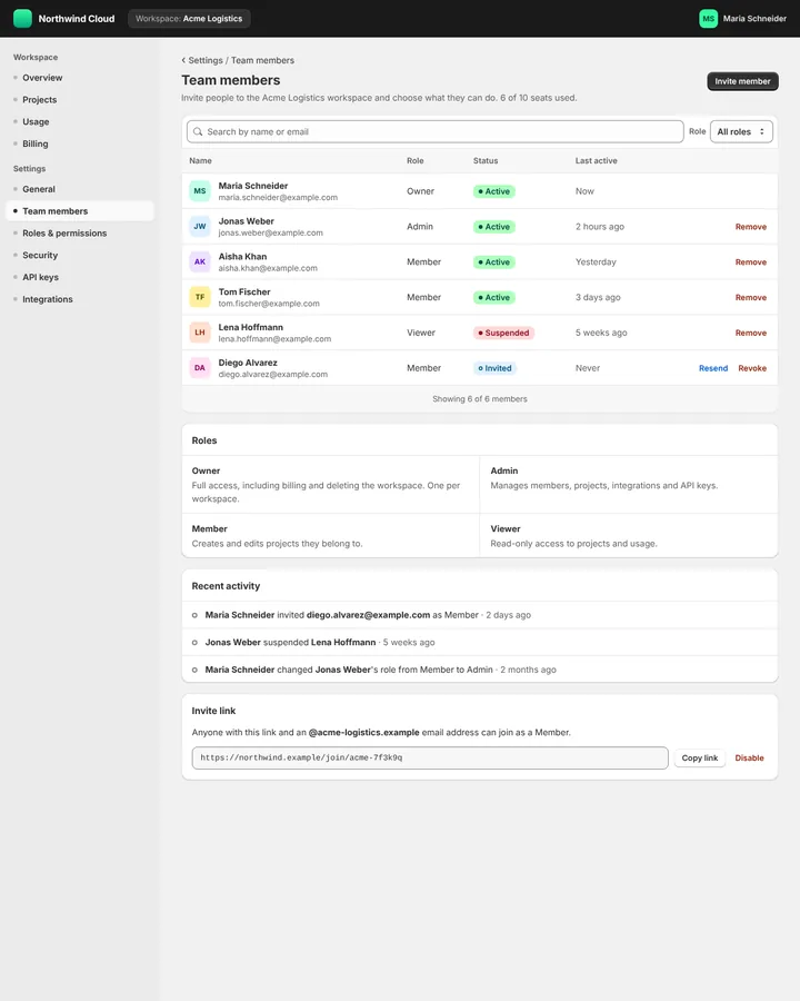
Shopify Polaris is the design system of the Shopify admin and of the apps that run inside it, published in 2017 with a style guide, content guidance, design tokens and a React component library. Since 2025 it ships as framework-independent web components with the s- prefix, and the React library is deprecated.
Shopify Polaris
Details
- Full Name
-
Shopify Polaris — "Shopify’s unified UI framework built on web components" (shopify.dev)
- Also known as
-
Polaris, Polaris web components, Polaris React (the deprecated library)
Core Concepts:
-
Pages for merchants. A page has a title, a primary action and secondary actions; content sits in cards and sections; resource lists and index tables show orders, products and customers.
-
Web components with the
s-prefix.<s-page>,<s-section>,<s-stack>and<s-button tone="critical" variant="primary">, loaded from Shopify’s CDN and usable with any framework (Using Polaris components). -
The React library.
@shopify/polariswithPage,Layout,Card,IndexTable,BlockStack,InlineStackandBadge— what most code written before 2025 uses. -
Design tokens. CSS custom properties with the
--pprefix such as--p-color-bg-surface, from@shopify/polaris-tokens. -
Content guidance. Polaris has always included rules for voice, tone and wording in merchant-facing interfaces, not only components.
- Key Proponents
-
Shopify. Polaris was made available to partners at Shopify Unite 2017 with a style guide, content guidance, CSS, a React component library and a Sketch kit (Liz Couto, Shopify Partners blog, 2017); Polaris web components became stable on 1 October 2025 (Shopify changelog)
When to Use:
-
Building Shopify apps, admin extensions or merchant-facing back offices. In our prior test, every anchor run of a team-settings page built a Polaris
Pagewith a primary action, anIndexTableandBadgetones. -
Designing dense, task-focused admin screens with clear primary actions
-
Writing interface copy for merchants along Polaris’s content rules
Common Misunderstandings:
-
Saying "Polaris" alone. The bare word resolves to the North Star on every tier we tested; "Shopify Polaris" pins it.
-
Expecting web components from the model. Every anchor run in our test wrote Polaris React, and none wrote
s-components. The React library is deprecated, and React-rendered parts "won’t follow the updated Shopify admin" (Polaris 2). For new apps, ask for Polaris web components and give the link to shopify.dev.
Criticism:
-
A forced migration. Daniel Curtis, "Shopify Upgrades Checkout Blocks to Polaris Web Components" (InfoQ, 2026), reports for checkout UI extensions that after a year, with the 2026-01 version mandatory, "sentiment has been more mixed": developers called the unversioned CDN script a risk for stability and the components incomplete, while bundles shrank by 40 to 85 per cent.
Current Status:
-
Web components and Polaris 2. The Polaris React repository is archived and "will not receive updates or maintenance"; the old documentation sites redirect to shopify.dev. The redesigned admin began rolling out on 15 September 2026, and the Polaris 2.0 release candidate of 24 September 2026 requires apps to move to web components; Built for Shopify apps have until 1 May 2027 (changelog). The training-data prior is the React era.