The Salesforce Lightning Design System (SLDS) is Salesforce's open-source enterprise design system, launched in 2015: CSS with the slds- prefix and BEM naming, component blueprints and guidelines for the Salesforce platform. The term design tokens comes from its team, and SLDS 2 of 2025 replaces the tokens with CSS custom properties called styling hooks.
Salesforce Lightning Design System (SLDS)
Details
- Full Name
-
Salesforce Lightning Design System (SLDS), since 2025 also SLDS 2
- Also known as
-
SLDS, Lightning Design System
Core Concepts:
-
Component blueprints in plain CSS. Every selector carries the
slds-prefix and follows BEM:slds-page-header,slds-table,slds-button slds-button_brand,slds-media(FAQ). -
The origin of design tokens. The Salesforce team chose the term design tokens and built the Theo tool to transform them (Trailhead).
-
Styling hooks in SLDS 2. SLDS 2 "separates the structure from the visual design using styling hooks" and replaces design tokens with global CSS custom properties, for example
--slds-g-spacing-2instead of--lwc-spacingSmall(LWC guide). -
Lightning Web Components. Salesforce’s own component framework implements the blueprints as base components such as
lightning-buttonandlightning-datatable. -
Salesforce Cosmos. The default theme of SLDS 2.
- Key Proponents
-
Salesforce. The work began in 2013; the system launched in 2015 as "the world’s first open-source enterprise design system" (Trailhead). Jina Anne: "I showed that to the team at Salesforce and then that kind of is where the concept of design tokens spawned off of" (Smashing Podcast, 2019)
When to Use:
-
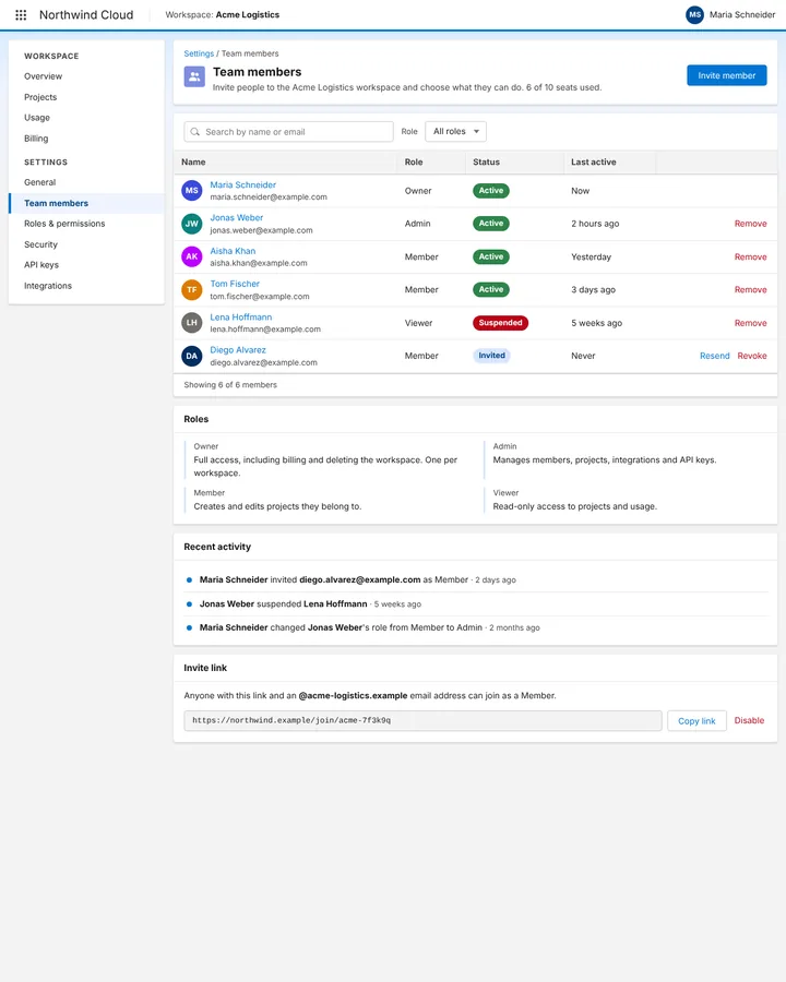
Building Salesforce apps, Lightning pages or external tools that should look native in Salesforce. In our prior test, every anchor run of a team-settings page wrote
slds-markup withslds-page-header,slds-tableandslds-button. -
As the reference where design tokens began, and for BEM-named enterprise CSS
-
Name Lightning Web Components as well when you want platform components: in our test no run used them unprompted
Common Misunderstandings:
-
Saying "Lightning" alone. The bare word resolves to weather on every tier we tested; "SLDS" or the full name pins the design system.
-
Expecting SLDS 2 code. The models write SLDS 1 classes and design tokens. SLDS 2 uses global styling hooks (
--slds-g-*), and base components may only be styled through documented hooks. -
Equating SLDS with Lightning Web Components. SLDS is the CSS and the guidelines; LWC is the component framework that uses them.
Criticism:
-
Migration is manual and coverage is partial. Andreea Doroftei, "SLDS 2: How You Can Future-Proof Your Salesforce UI" (Salesforce Ben): "If you have an existing SLDS 1 theme you would like to migrate to SLDS 2, you will need to manually recreate it"; Visualforce, Setup and CRM Analytics are not covered.
-
Little room to style. Salesforce itself states: "Overriding base component styling isn’t supported except when using documented styling hooks" (CSS anti-patterns).
Current Status:
-
SLDS 2 is generally available. Introduced in Spring '25 as "the foundation for the agentic design system" with Salesforce Cosmos as its default theme (Salesforce blog, 2025), SLDS 2 became generally available with Winter '26; dark mode remains in beta (Salesforce Ben). The prior serves SLDS 1; ask for SLDS 2 and styling hooks explicitly.