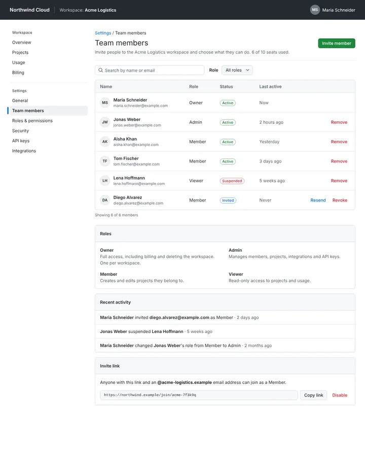
Primer is GitHub's design system: the colour, spacing and typography tokens of Primer Primitives, the components of Primer React and Primer ViewComponents for Rails, Primer CSS and the Octicons icon set. It began as a CSS gem in 2012, and since 2026 it is styled with CSS Modules instead of CSS-in-JS.
Primer (GitHub Design System)
Details
- Full Name
-
Primer — GitHub’s design system (primer.style)
- Also known as
-
GitHub Primer, Primer React, Primer CSS
Core Concepts:
-
Primitives as tokens. Colour, spacing and typography live in
@primer/primitives. Names are built from blocks — namespace, pattern, variant, property, scale — for examplefgColor-default,bgColor-inset,borderColor-accent-emphasisandbase-size-4(Token names). Light and dark modes span nine themes. -
Components in React and Rails.
@primer/react(formerly@primer/components) and the gemprimer_view_components;PageHeader,ActionList,ActionMenu,UnderlineNav,LabelandBlankslateare signature parts. -
Octicons. "SVG icons built by GitHub for GitHub".
-
Product UI and Brand UI. Primer covers the product interface and, separately, GitHub’s marketing pages.
-
The look of GitHub. Neutral canvas, subtle borders, compact density, blue accents for actions, green for the primary button.
- Key Proponents
-
GitHub. Designers began documenting patterns in 2011, and in 2012 the CSS was packaged as a Ruby gem named Primer; the design systems team formed in 2016 with Diana Mounter and Jon Rohan as its first full-time members (Diana Mounter, "Design systems at GitHub", 2018). Mark Otto contributed in the early years
When to Use:
-
Building GitHub Apps, developer tools or internal dashboards that should feel like GitHub. In our prior test, every anchor run of a team-settings page imported
@primer/reactand Octicons; five of six usedPageHeader. -
Studying a token naming scheme built from composable blocks
-
Rails applications through Primer ViewComponents
Common Misunderstandings:
-
Saying "Primer" alone. On Sonnet the bare word resolves to biology and paint first; "Primer (GitHub)" or "GitHub’s Primer" pins it.
-
Styling with
sxand styled-components. Five of six runs in our test used thesxprop. Primer React has removed it: all components moved to CSS Modules, and "GitHub has been running on 100% CSS modules as of June 2026" (Josh Black and Marie Lucca, GitHub Blog, 2026). Ask for CSS Modules when the code must run on current Primer React. -
Taking Mona Sans as Primer’s UI font. Mona Sans and Hubot Sans, released in 2022, are GitHub’s brand typefaces; their announcement does not tie them to Primer’s product interface (GitHub Blog, 2022).
Criticism:
-
Runtime styling did not scale. GitHub’s own engineers write that with CSS-in-JS, "updates to styles grew out of control as component count grew on a page"; the move to CSS Modules cut server-render time by 55 per cent (GitHub Blog, 2026).
-
Accessibility is uneven. Marc Alcobé of OpenProject, which adopted Primer, notes that "not all existing components are reviewed for accessibility" (OpenProject blog, 2023).
Current Status:
-
CSS Modules everywhere. Since June 2026 GitHub runs entirely on CSS Modules, the
sxprop is gone, and@primer/styled-reactserved as a transitional shim; theming variables live in@primer/css(GitHub Blog, September 2026). The training-data prior predates this change.