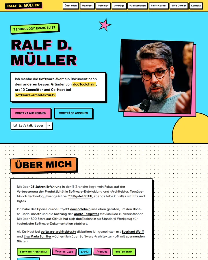
Neo-Brutalism is a web and UI design style with thick black outlines, hard offset shadows without blur, flat saturated colours, blocky visible structure and heavy plain type. Unlike raw brutalist web design it keeps a grid and a clear hierarchy; it spread as a community trend.
Neo-Brutalism
Details
- Full Name
-
Neo-Brutalism — a visual style for web and UI design with thick black borders, hard offset shadows, flat saturated colours and blocky layouts
- Also known as
-
Neobrutalism, neubrutalism
Core Concepts:
-
Thick black outlines. Cards, buttons and images carry a solid black border of two to four pixels. The outline, not a soft shadow, separates an element from its background.
-
Hard offset shadows. Shadows are solid black or dark blocks shifted a few pixels down and to the right, with no blur. On hover, an element often moves into its shadow to look pressed.
-
Flat, saturated colour. Large areas of strong colour — yellow, pink, mint, blue — with no gradients. Black text sits on top.
-
Blocky, visible structure. Layouts are built from rectangles with sharp or slightly rounded corners. The grid shows; nothing hides that the page is made of boxes.
-
Bold, plain type. Heavy grotesque or monospace fonts, large headings, often in capitals.
-
Order under the noise. Unlike raw brutalist web design, the style keeps a grid, a clear hierarchy and conventional navigation. The Nielsen Norman Group describes it as a more colourful and orderly descendant of brutalism and a reaction against sleek minimalism.
- Key Proponents
-
No single originator. The style spread as a community trend in product and web design; the Nielsen Norman Group defines it in "Neobrutalism: Definition and Best Practices" (Hayat Sheikh, 2025) and names Gumroad and Figma’s brand refresh as examples
When to Use:
-
Landing pages, portfolios and marketing sites that should look loud, playful or deliberately unpolished
-
Products for designers, developers and creative audiences, where an informal tone fits
-
As a counter-instruction when generated designs drift towards soft gradients, rounded cards and blurred shadows
Common Misunderstandings:
-
Confusing it with brutalist web design. Raw brutalism ignores conventions on purpose. Neo-Brutalism keeps order, a grid and a clear hierarchy.
-
Reading high contrast as accessible. Black outlines are high contrast, but saturated colour pairs can still fail text contrast checks.
-
Using it everywhere. The playful look clashes with contexts that depend on trust, such as banking or health.
-
Using the bare "brutalism". In our prior test on 2026-10-28, "What is brutalism?" resolved to architecture on all tiers. With "Use neo-brutalism." a bakery landing page got black borders and hard offset shadows in six of six runs; none of six baselines used either. The prefix is what reaches the web style.
Criticism:
-
Loud styling can cost usability. Hayat Sheikh warns in "Neobrutalism: Definition and Best Practices" (Nielsen Norman Group, 2025) that "without balance, it can overwhelm users and hinder accessibility". She advises two or three colours and neutral fonts for body text.
-
The parent style trades usability for attitude. Kate Moran argues in "Brutalism and Antidesign" (Nielsen Norman Group, 2017) that deliberately hard-to-read layouts conflict with getting tasks done: "nobody ever complains that a site is too easy to understand."