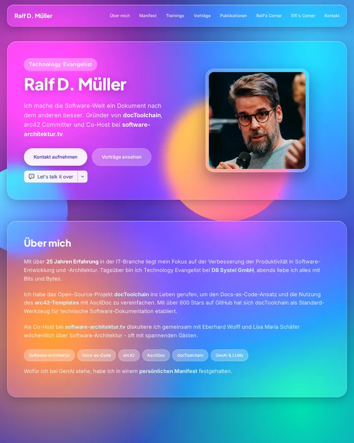
Glassmorphism is a UI style of translucent, frosted-glass panels that blur the colourful background behind them, float on separate layers and carry a subtle light border. Michał Malewicz named it in 2020; in CSS it rests on semi-transparent fills and backdrop-filter blur.
Glassmorphism
Details
- Full Name
-
Glassmorphism — a UI style of translucent, frosted-glass panels with background blur and a subtle light border, layered over a colourful background
- Also known as
-
Frosted glass UI, glass UI
Core Concepts:
-
Frosted transparency. Panels are semi-transparent, typically a white or dark fill at low opacity, and blur whatever lies behind them. In CSS this is
backdrop-filterwith a blur radius, for examplebackdrop-filter: blur(16px). -
Layers that float. Panels sit on separate planes above the background and above each other, so depth comes from transparency, not from heavy shadows.
-
A vivid background to blur. The effect needs something to show through: gradients, coloured blobs or photos behind the glass.
-
A subtle light border. A thin, semi-transparent white edge catches the light and separates the panel from the background.
-
Soft shadows and rounded corners. Panels have generous radii and, at most, a soft shadow beneath them.
- Key Proponents
-
Michał Malewicz, who named the style in "Glassmorphism in user interfaces" (UX Collective, 22 November 2020) and listed its four traits: frosted transparency, floating layers, vivid colours and a subtle light border.
When to Use:
-
Overlays, cards and control panels that sit on top of imagery or colourful gradients
-
Marketing pages, music and media apps, dashboards that should feel light and layered
-
As a counter-instruction when generated designs use flat opaque cards and you want depth without heavy shadows
Common Misunderstandings:
-
Expecting it from a related task. In our prior test on 2026-10-29, a music player’s now-playing screen already got a blurred background in all six baselines. On a neutral task — the pricing section of a SaaS landing page — no baseline made its cards translucent or used
backdrop-filter; with "Use glassmorphism." six of six runs did both. -
Forgetting the background. Glass over a plain white page shows nothing. The style needs colour or imagery behind it.
-
Reading translucent as legible. Text on glass sits on a shifting background; contrast has to be checked against the busiest area behind it.
-
Confusing it with neumorphism. Neumorphism extrudes soft shapes from a solid surface; glassmorphism layers transparent panes.
Criticism:
-
Hard on people with disabilities. Nicko Syropoulos writes in "Glassmorphism Meets Accessibility: Can Glass Be Inclusive?" (Axess Lab, 2025) that "this style offers great challenges even if it is aesthetically pleasing". He names weak text contrast over colourful images, distracting backgrounds, blur and motion that can cause eye strain, and blurred boundaries that hide controls.
Current Status:
-
Back in the mainstream with Liquid Glass. Apple’s 2025 design language for iOS 26 and its other platforms uses a translucent material that, in Apple’s words, "reflects and refracts its surroundings". Without further context, "glassmorphism" most likely means the 2020 style of Malewicz’s article; for Apple’s version, name Liquid Glass and the Apple Human Interface Guidelines.