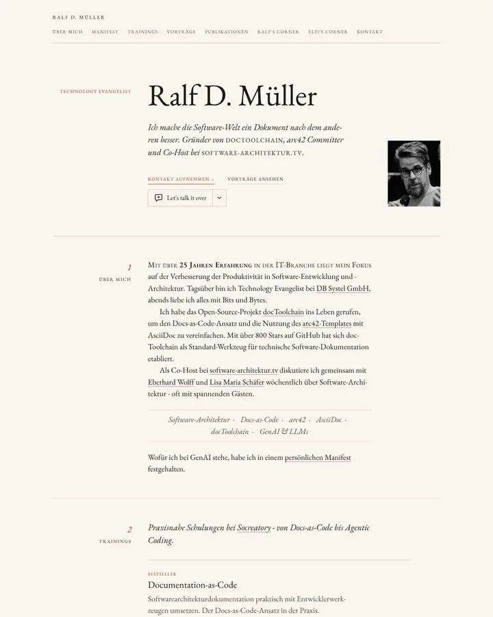
The Elements of Typographic Style is Robert Bringhurst's 1992 reference work on book typography, now in version 4.0. As an instruction it brings a comfortable measure, careful leading, old-style figures in running text, small caps for abbreviations, indented paragraphs and hanging punctuation.
The Elements of Typographic Style (Bringhurst)
Details
- Full Name
-
The Elements of Typographic Style by Robert Bringhurst, published by Hartley & Marks; first edition 1992, latest version 4.0 (2012)
- Also known as
-
Bringhurst
Core Concepts:
-
A comfortable measure. Single-column text runs 45 to 75 characters per line; Bringhurst calls 66 ideal.
-
Figures that sit in the text. Running text uses old-style figures, which blend with lowercase letters.
-
Small caps for abbreviations. Acronyms and abbreviations in running text are set in small caps, so they do not shout.
-
Indent or space, not both. Mark a new paragraph with an indent or with space between paragraphs. Do not indent the first paragraph after a heading.
-
Optical alignment. Hanging punctuation keeps the text edge straight to the eye; capitals and small caps get extra letterspacing.
-
A chosen scale of sizes. Sizes come from a deliberate scale, not from chance. The book’s chapter on this is a source for the Modular Scale.
-
Rules with reasons. Each rule is a reasoned convention from centuries of book typography, to be applied with judgment.
- Key Proponents
-
Robert Bringhurst, Canadian typographer, poet and translator. Editions: 1992; 1996; version 2.4 (2001) and 2.5 (2002); version 3.0 (2004), 3.1 (2005) and 3.2 (2008); version 4.0 (2012). Hermann Zapf hoped it would become the typographers' bible (Wikipedia)
When to Use:
-
CSS for articles, documentation and other long-form text. In our prior test the book’s name added old-style figures and indented paragraphs in every run, and small caps and hanging punctuation in most.
-
Reviewing the typography of reports, books and PDFs
-
Together with the Modular Scale when heading sizes also need a rule
-
As a counter-instruction when generated text styles stop at font size and line height
Common Misunderstandings:
-
Treating it as a UI rulebook. The book is about book typography. Its rules fit running text better than buttons, forms and dashboards.
-
Reading the rules as law. They are conventions with reasons. Bringhurst explains why each one exists, so a reader can judge when it does not apply.
-
Quoting "66 characters" without the range. The ideal sits inside a range of 45 to 75 characters for single-column text.
-
Expecting the baseline to reach the details. In our prior test on 2026-10-28, the baselines set a measure and a line height and stopped there. With the book’s name, six of six set old-style figures and indented paragraphs instead of spacing them; four of six added small caps and hanging punctuation, Sonnet and Opus in all four runs.
Criticism:
-
Tied to print. Maurice Meilleur reviews version 4.0 in "The Elements of Typographic Style, Version 4.0" (Typographica, 2013). He finds that the book "has an easier time thinking backwards": screen typography gets two pages, and display type is mostly missing. He notes that it reads like holy writ and advises students to read it, but not first and not alone.