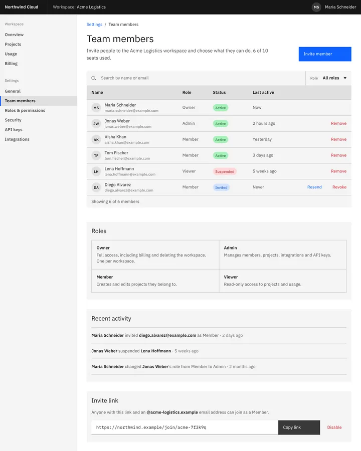
The Carbon Design System is IBM's open-source design system, developed in public since 2015 as the digital form of the IBM Design Language. It combines IBM Plex type with productive and expressive type sets, the 16-column 2x Grid, four themes from White to Gray 100, design tokens such as layer-01, and components in @carbon/react and @carbon/web-components.
Carbon Design System
Details
- Full Name
-
Carbon Design System — "the digital manifestation of the IBM Design Language" (Carbon)
- Also known as
-
Carbon, IBM Carbon
Core Concepts:
-
IBM Plex in two type sets. IBM Plex Sans, Serif and Mono; the productive set (suffix -01) for product interfaces and the expressive set (suffix -02) for editorial pages (Typography).
-
The 2x Grid. A 16-column grid on which spacing and component sizes are built.
-
Four themes and layering tokens. White, Gray 10, Gray 90 and Gray 100; tokens such as
$background,$layer-01,$text-primaryand$interactivestack surfaces by layer rather than by fixed colour (Themes). -
Flagship code in React and Web Components.
@carbon/reactand@carbon/web-components, with classes prefixedcds--; theDataTableand the UI Shell header and side navigation are signature pieces. -
Carbon for AI. An extension with the AI label, which opens an explanation of how AI produced the content (Carbon for AI).
When to Use:
-
Building enterprise and data-heavy interfaces — admin consoles, dashboards, developer tools — with dense data. In our prior test, every anchor run of a team-settings page imported
@carbon/reactand built aDataTable; five of six named a Carbon theme. -
Theming with layered surface tokens and a dark Gray 100 theme
-
Marking AI-generated content with the Carbon for AI patterns
Common Misunderstandings:
-
Saying "Carbon" alone. The bare word resolves to chemistry on Sonnet and Opus and to Google’s Carbon programming language on Haiku in our test. "Carbon Design System" pins it.
-
Writing version 10 code. The packages
carbon-componentsandcarbon-components-reactare deprecated; version 11 renamed tokens, prefixes classescds--instead ofbx--and moved to Sass modules. Migration "will be a manual process" (Migration FAQ).
Criticism:
-
Gaps left to the app team. Grace Potma’s design-system comparison for OpenMRS ("Style Guide & Design Systems Analysis", 2020) notes an "accessibility gap in React version of dropdown" in the Carbon of that time and that spacing was "mostly left to the app developer".
Current Status:
-
Version 11, with "Carbon Next" previewed. Version 11 is current; v10 assets were deprecated on 30 September 2024. A preview of the next major version promises a new visual expression, layouts as a core framework, "industry-standard token naming" and AI readiness with agent skills (Carbon Next, August 2026). The prior serves version 11.