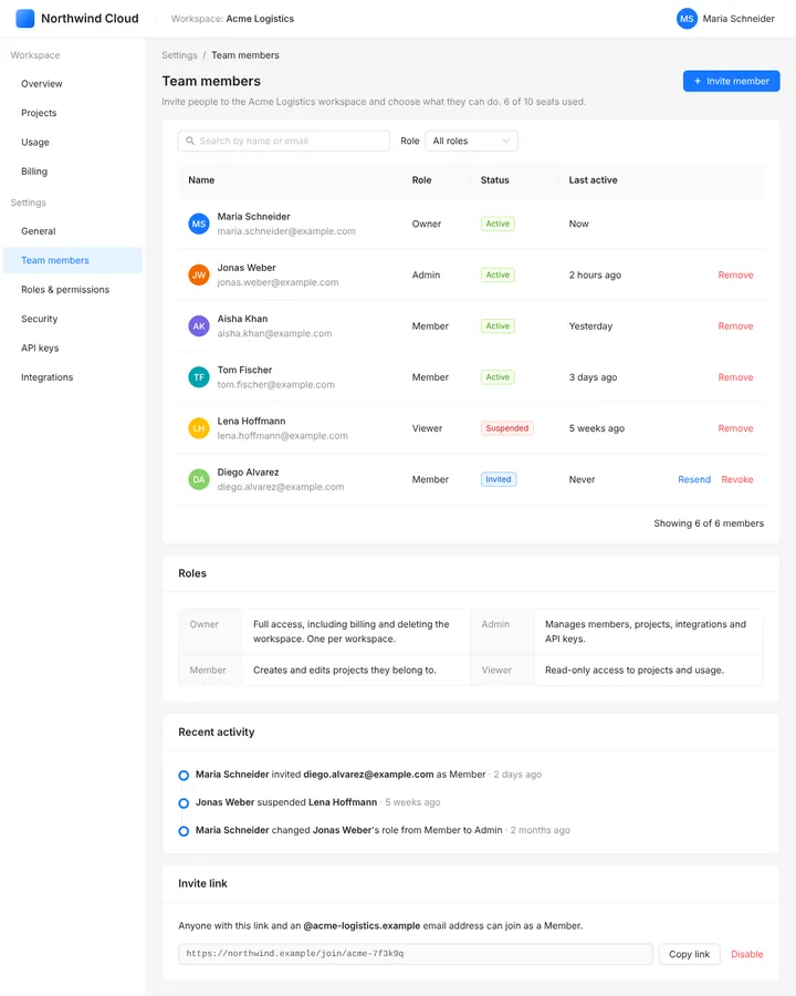
Ant Design is the enterprise design language and React component library (antd) from Ant Group, the Alibaba affiliate behind Alipay, released publicly in 2015. Built for data-heavy admin and back-office interfaces, it offers components such as Form, Table and ConfigProvider, and a theme system of seed, map and alias tokens.
Ant Design
Details
- Full Name
-
Ant Design — "A UI Design Language" (GitHub organisation) and its React implementation
antd - Also known as
-
antd, AntD
Core Concepts:
-
Four design values. Natural, Certain, Meaningful and Growing; "Certain" aims at "high certainty and low cooperative entropy" (Design Values).
-
Forms by declaration. A
FormholdsForm.Itemfields withnameandrules;onFinishreceives the validated values,Form.useFormgives access to the form instance (Form). -
Components for dense data.
Tablewith sorting, filters and pagination, plusDescriptions,Tree,TransferandStepsfor back-office screens. -
Three token layers. Seed tokens are "the origin of all design intent", map tokens derive from them, and alias tokens style groups of components;
ConfigProvidertakes athemeobject withtoken, analgorithmfor dark or compact themes, and per-component overrides incomponents(Customize Theme). -
A family of projects. Ant Design Pro (an admin template), Ant Design Mobile, Ant Design Charts and Ant Design X for AI interfaces sit beside the core library.
- Key Proponents
-
Ant Group (formerly Ant Financial), with afc163 as its long-time lead maintainer. Released publicly in July 2015 (LogRocket, 2024); version 5 in November 2022 (Ant Design blog), version 6 in November 2025
When to Use:
-
Building admin consoles, dashboards and other back-office interfaces in React with many forms and tables. In our prior test, every anchor run of a sign-up form imported from
antdand usedForm.Itemwithrules,Input.PasswordandonFinish. -
Theming a whole application from a few seed tokens
-
Teams that want a complete, opinionated component set rather than primitives to assemble
Common Misunderstandings:
-
Treating the design language and the library as one thing. "Ant Design" names both the design specification and the
antdpackage; Pro, Mobile and X are separate projects. -
Expecting the v4 theming API. Version 4 themed through Less variables; version 5 replaced them with CSS-in-JS tokens, and version 6 defaults to CSS variables.
Criticism:
-
The Christmas easter egg. In 2018 an unannounced commit made antd 3.9.3 to 3.11.5 show snow on buttons on 25 December in production apps. The maintainer apologised in issue #13849: "It is a complete stupid decision of my own and very sorry to everyone that get involved." The Chinese tech outlet TMTPost summed up the reaction: an easter egg from developers to users is a surprise, one from a framework to developers is a scare (TMTPost, 2018).
-
Weight. Elijah Asaolu, "Ant Design adoption guide" (LogRocket, 2024), cautions: "keep in mind that Ant Design components can be heavy."
Current Status:
-
Version 6 with CSS variables. Ant Design 6.0, released in November 2025, defaults to "pure CSS Variables mode" with an optional zero-runtime build, needs React 18 or later, restructures every component’s DOM for semantic styling and removes APIs deprecated in version 4 (release post). The current release is 6.6.7 of 20 October 2026 (Changelog). Version 6 is newer than most training data; for its specifics, name the version.