Adobe Spectrum is Adobe's design system for its desktop, web and mobile applications, in use since 2013 and redesigned as Spectrum 2 from 2023. It ships as React Spectrum, Spectrum Web Components and Spectrum CSS with shared design tokens and the Adobe Clean typeface, and its React implementation builds on the accessible hooks of React Aria.
Adobe Spectrum
Details
- Full Name
-
Adobe Spectrum — Adobe’s design system, in its second generation Spectrum 2
- Also known as
-
Spectrum, Spectrum 2, S2, React Spectrum (the React implementation)
Core Concepts:
-
Three implementations, one set of tokens. React Spectrum (
@adobe/react-spectrum, and@react-spectrum/s2for Spectrum 2), Spectrum Web Components and Spectrum CSS share the tokens in@adobe/spectrum-tokens. -
Token names from broad to specific. "Names communicate information from broad concepts toward more specific details", for example
accent-background-color-hoverorpositive-color-600(Design tokens). -
Components that guard the design. React Spectrum v3 refuses ordinary
classNameandstyleprops and offersUNSAFE_classNameas "a last resort", because "future updates to Spectrum design may cause unintended breaking changes in products" (Styling). Spectrum 2 replaces style props with a build-time style macro. -
Accessibility in the hooks. Behaviour and keyboard handling come from React Aria; components such as
TableView,ActionButtonandDialogTriggercarry it. -
Adobe Clean. The signature typeface; Spectrum 2’s icons are drawn to match it.
- Key Proponents
-
Adobe. Spectrum has been implemented across Adobe products since 2013; Spectrum 2 was unveiled on 12 December 2023 for more than 100 applications (Adobe blog). The Spectrum 2 core team includes Shawn Cheris, Garth Braithwaite and Patrick Fulton (Introducing Spectrum 2)
When to Use:
-
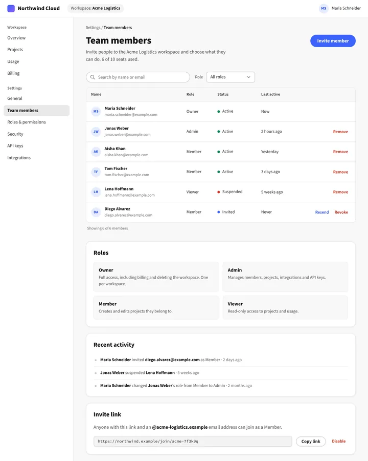
Building plug-ins and web apps for the Adobe ecosystem, or tools that should feel like Adobe’s applications. In our prior test, every anchor run of a team-settings page imported
@adobe/react-spectrumand built aTableViewwithActionButton`s and size tokens such as `size-200. -
Using accessible components whose behaviour comes from React Aria
-
Studying a token naming scheme that runs from concept to detail
Common Misunderstandings:
-
Saying "Spectrum" alone. The bare word resolves to physics on every model tier we tested, and it also names a US internet provider and a home computer. "Adobe Spectrum" pins the design system.
-
Expecting Spectrum 2 code. The models write React Spectrum v3. Spectrum 2 uses
@react-spectrum/s2and the style macro; a codemod migrates from v3. Ask for Spectrum 2 explicitly.
Criticism:
-
Consistency for Adobe, not for the platform. Jason Snell, "Adobe out of Photoshop" (Six Colors, 2026), on the Spectrum-based Photoshop interface: cross-platform design systems "are for the benefit of Adobe, which can standardize its interface across platforms and its own apps", at the cost of Mac conventions.
Current Status:
-
Spectrum 2 is stable in React, in beta for Web Components. React Spectrum’s Spectrum 2 implementation reached version 1.0 on 16 December 2025 (release notes); Spectrum Web Components 2.0 with full Spectrum 2 styles entered public beta in July 2026. Photoshop’s refreshed interface built on Spectrum is in beta as of October 2026. The prior serves React Spectrum v3; Spectrum 2 may come out thin unless named.